Automotive HMI concept design

"We have a new prototype vehicle with a beautiful gigantic screen. But our interaction concept does not work. Please fix."


  • Client: Japanese OEM
  • Role: UX, prototyping, art direction
  • Year: 2023
  • Status: concluded
header image
Our drivers tell us driving with our current concept makes them feel nauseated.

Objective

Create a novel interaction concept for a prototype vehicle for a major Japanese OEM (name confidential). There are two screens in the vehicle. The first one spans the entire width of the dashboard (’coast-to-coast’ display) and is out of physical reach while driving. The second one offers touch interaction and is centre-mounted and therefore responsible of controlling the larger one.

What We've Done

  • Strategic discovery
  • Concept creation
  • In-vehicle prototyping
  • Visual design outlook
  • On-site concept implementation in prototype vehicle
  • Client presentation

Creative Process

  • Research: we conducted research on the business's values, competitors, and target audience to gain a better understanding of their brand and industry.
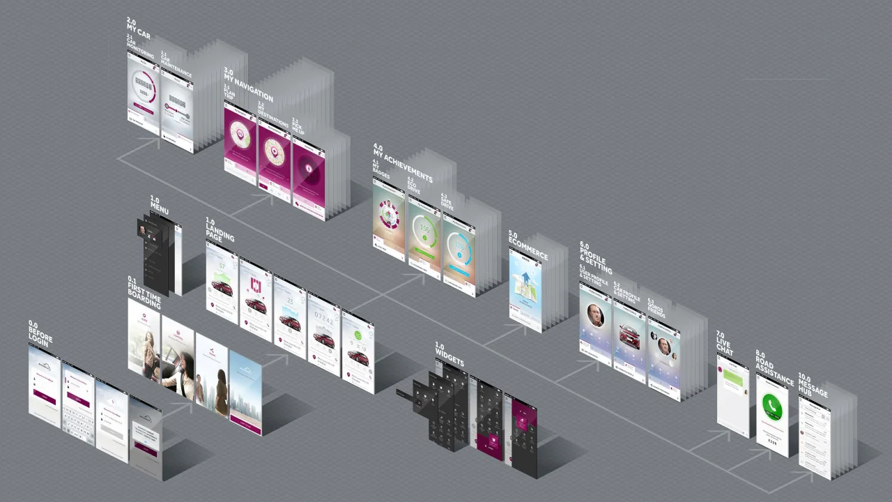
  • Whiteboarding: research fuelled our numerous whiteboard sessions during which we laid out the fundamental paradigms, mental models, interaction concepts, and hardware controls.
  • Wireframing: after distilling promising concepts from brainstorming, we began exploring those in more detail on paper and digitally.
  • Prototyping: to test, improve, dismiss or validate our concepts, we set up a seating buck. The screens configuration resembled the prototype vehicle of the client.
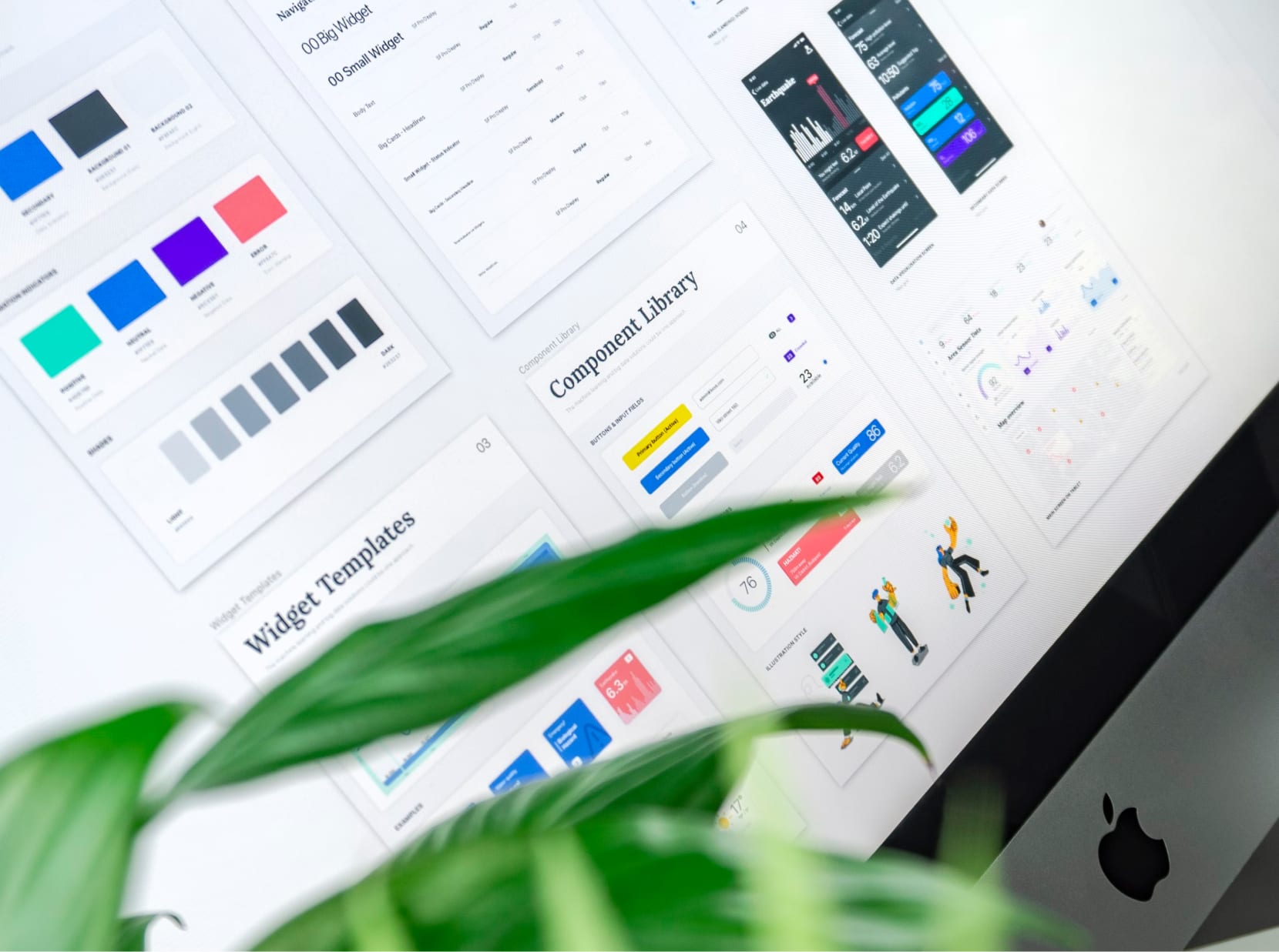
  • Art direction: the mental model of the final concept also works beautifully in visual design. Even though it wasn’t part of the scope, we created a few hero screens that illustrated the power of a cohesive mental model and visual design language.
  • Presentation: we distilled everything into a gigantic Keynote file, stuffed a NUC with all sorts of cables into our luggage and hopped over to Japan.
header image

Results

Our prototypes running on the client’s prototype vehicle made a huge impact. They were interactive straight from the installed vehicle screens and hardware buttons. The client liked the concept and hired icon incar to fully implement the concept during a much longer design phase.

visual teaser blurred

Conclusion

The concept wasn’t just novel but also coherently connected the two screens which made interaction simple, consistent, predictable, and fun.

My work directly ensured the agency that had hired me a much larger follow-up job that has already commenced.

For more information on this project, please contact me directly.

Other work