QorosQloud 3

QorosQloud, a pioneer in connected car services, was dpoised for a substantial transformation. We undertook a comprehensive overhaul, reinventing every aspect to deliver a cutting-edge experience that matches the class-leading vehicle conncectivity.


  • Client: Qoros Auto
  • Role: UX, UI, research, prototyping
  • Year: 2015 - 2016
  • Status: concluded
3d sitemap of information architecture with key screens

👉 [skip this part if you’ve already read a Qoros case study]

Qoros Auto was still a young automotive startup based in Shanghai during my time there. Their products aim at young, hip, well-educated consumers who care more about innovation, connectivity, and value than about brand, status, or status symbols. Simply put, digital natives.

Qoros vehicles are always connected and offer sophisticated connectivity features, back than a rather novel and disruptive approach in comparison to the competition. At the heart of this connectivity lies QorosQloud, an ecosystem for vehicle-, mobile-, and web-based interactions and value-added services.

Task

After the first models had successfully launched, it became clear that we needed a complete overhaul of the mobile version of QorosQloud. With version 2.0 we had released a neater and prettier version, which, however, suffered from a plethora of features that had been added as an afterthought. Naturally, the app had started to feel convoluted a long time ago.

So we set out to create version 3 of QorosQloud in order to highlight Qoros’ innovative and modern products. Being a Chinese company, we had 3 main objectives:

  • Exude innovation & trendiness
  • Have a lot of/more features
  • Add a truly social component

In preparation for the project, I spent weeks and weeks ideating, researching, workshopping and driving new features that were meant to bring out the much-desired sparkle in the eyes of senior management. In the end, we came up with over 100 potential new features, ranging from low hanging fruits to technologically unfeasible. A non-final version can be found here: click for PDF.

Previously, we connected the car. Now we are connecting the driver.

Fortunately, design-wise we had the liberty of starting with a blank canvas, as long as we would incorporate all the features of the numerous product owners from various departments. As long as we delivered UX, UI, copy, and motion on time as well as handed everything off to the external developers, that is.

Team & My Role

We were a small design team in the Connected Services department. To meet the ambitious deadline it was clear we needed external support. We also wanted to diversify the design team to create a product that appeals to both Chinese and Westerners.

So we partnered with MING Labs to set up a truly diverse team of designers. The Qoros team joined MING folks in a dedicated office space to tackle the project head-on.

Being a Qoros employee as well as the most senior UX designer on the team, my role was leading the full-stack UX process as well as aligning with my manager. I also prepared decks so he could communicate (that is, advertise) our skunkworks operation to Qoros senior management as well as product owners.

Biggest Challenge

There is no single biggest challenge in any project, I believe. But in this one, it was a rather interesting set of challenges.

Let’s go with the lowest hanging fruit first: language barrier. Our team members spoke 7 different native languages, and we still needed to communicate. Hardly anyone was able to use their native language and we found ourselves using a nice blend of English and Mandarin.

Next up: consumer research had already been carried out by Qoros’ Marketing Department in, well, a marketing fashion. So I first translated their findings into Personas, User Stories, and Storyboards. And I then briefed the whole team to get everybody on the same page. This created the next challenge: for some team members, this was their 1st automotive project. They didn’t drive, didn’t speak the lingo (ugh, the abbreviations), didn’t know what to make of all vehicle specs, and didn’t have much empathy for the daily nuisances of driving a car in a megacity.

When I think back I now believe there actually is a single biggest challenge: Information Architecture. Chinese apps are much more feature-rich than Western apps. So I was challenged with coming up with a new IA for an ever-growing feature set that would hide complexity, facility playful exploration, have a low threshold, yet a high ceiling, and most importantly, be future proof for yet-to-be-determined functionality by a plethora of product owners. Oh, and avoid the “app in an app in app” feeling you often encounter when a lot of self-contained features are added into a single app. Obviously, an art director asking for a no-menu approach provided the much-needed balance of unicorns and fairies. Finally, due to cost savings we also needed to integrate the vehicle’s owner manual, i.e., create a digital version of it, into the app since the printed version was to be abandoned.

Approach

In order to not make the ton of features feel overwhelming, I wanted to start fresh. The old app’s IA simply didn’t scale anymore. I uninstalled it from my devices so I couldn’t use it as a reference. I told the team to do the same as I’d rather spend time really understanding a feature instead of glancing at the old implementation.

Subsequently, I created a content inventory by talking to stakeholders from all involved departments. Sitting down with all the product owners gave me the opportunity to learn about individual features, why they are there, and why they were implemented in a particular way. I questioned and challenged a lot of what I was presented. Occasionally, we managed to slim things down or merge two features into one.

2d sitemap with information architecture

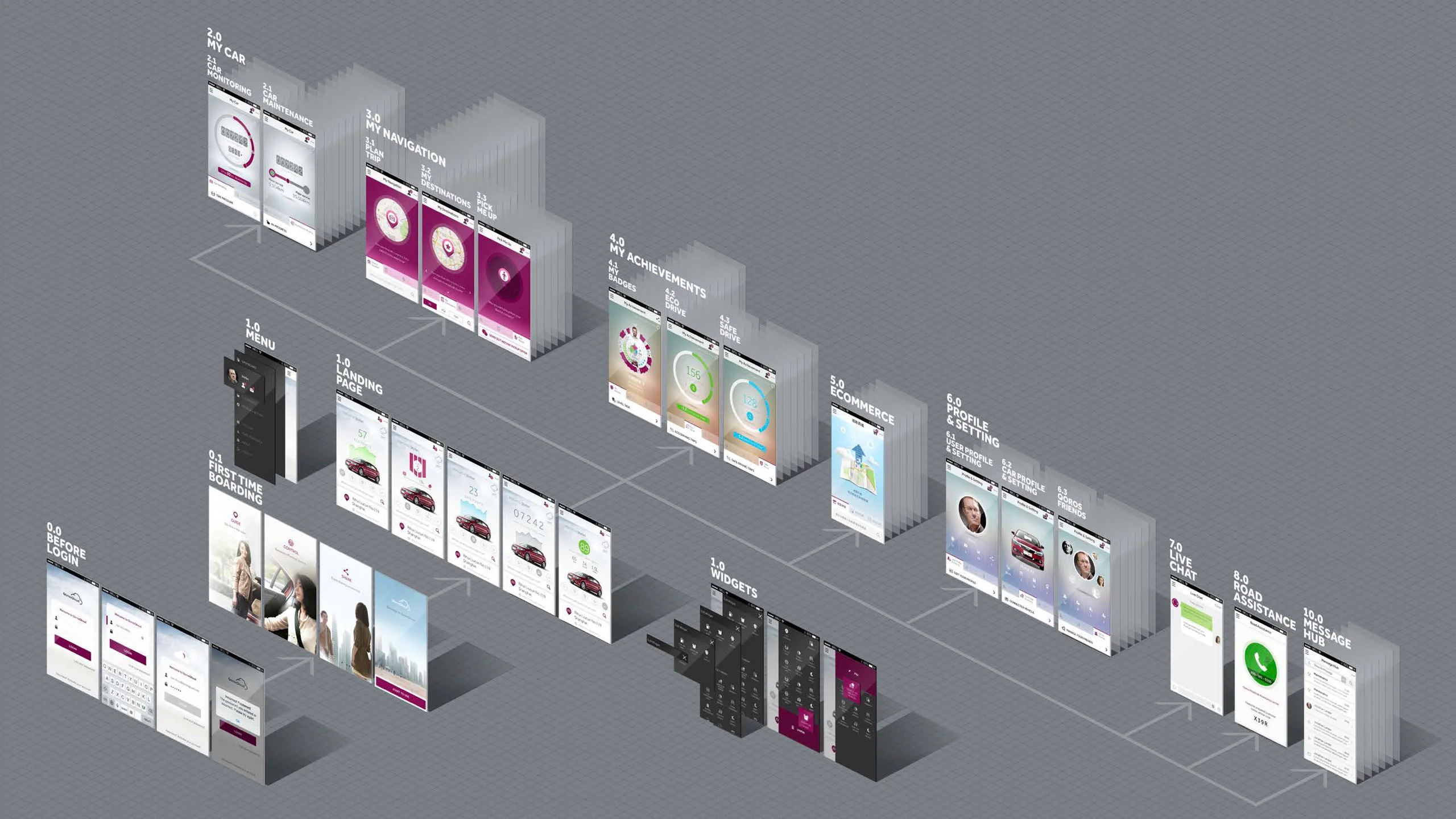
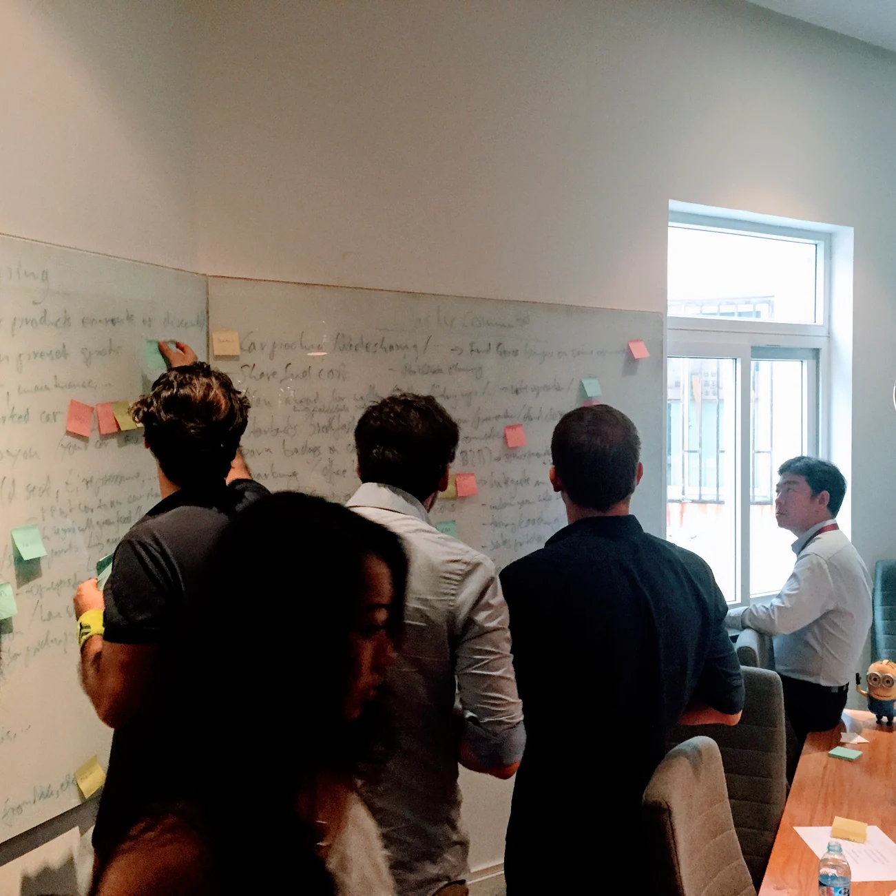
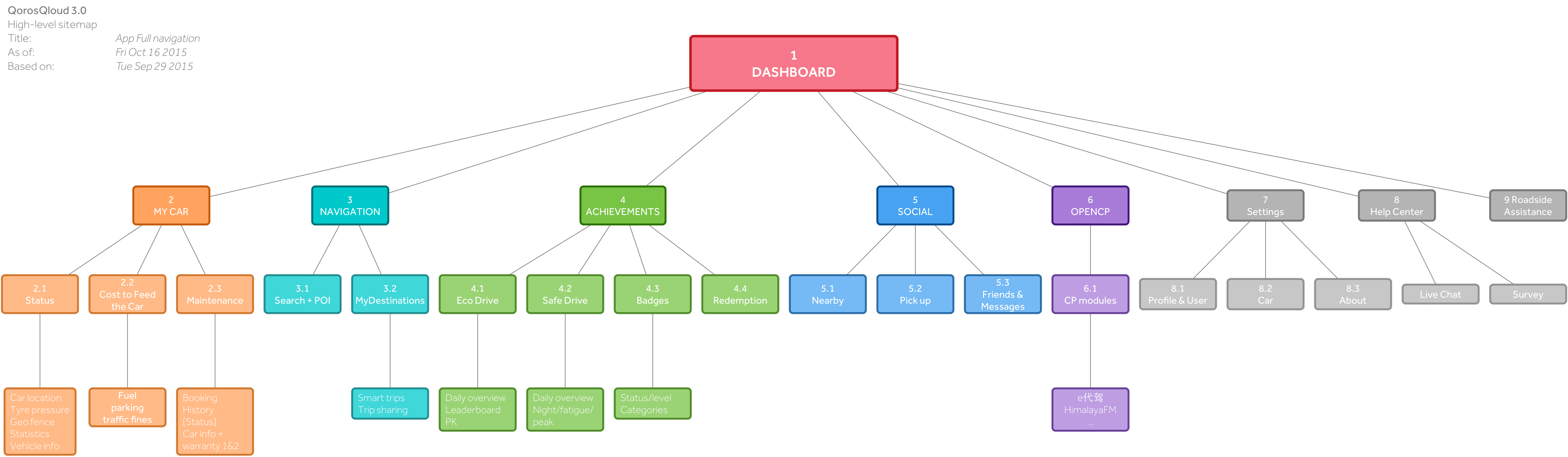
While laying out the IA, I always tried to have a basic user flow for each feature in the back of my head. This turned out essential when presenting the new IA to the product owners who all of sudden might no longer find their feature on the landing page. To most this is a huge blow and never acceptable (corporate politics seem to dictate that every product owner's feature is equally or more important than any other feature and, therefore, must be placed on the landing page). It took a lot of empathy, discussions, and back-and-forth to get everyone onboard. I would often explain how features would now work in conjunction with others instead of being an isolated feature set and how this would improve the experience of the PO’s feature as well as the overall experience of the app. [Sorry for the GIFs, properly embedded videos coming asap]

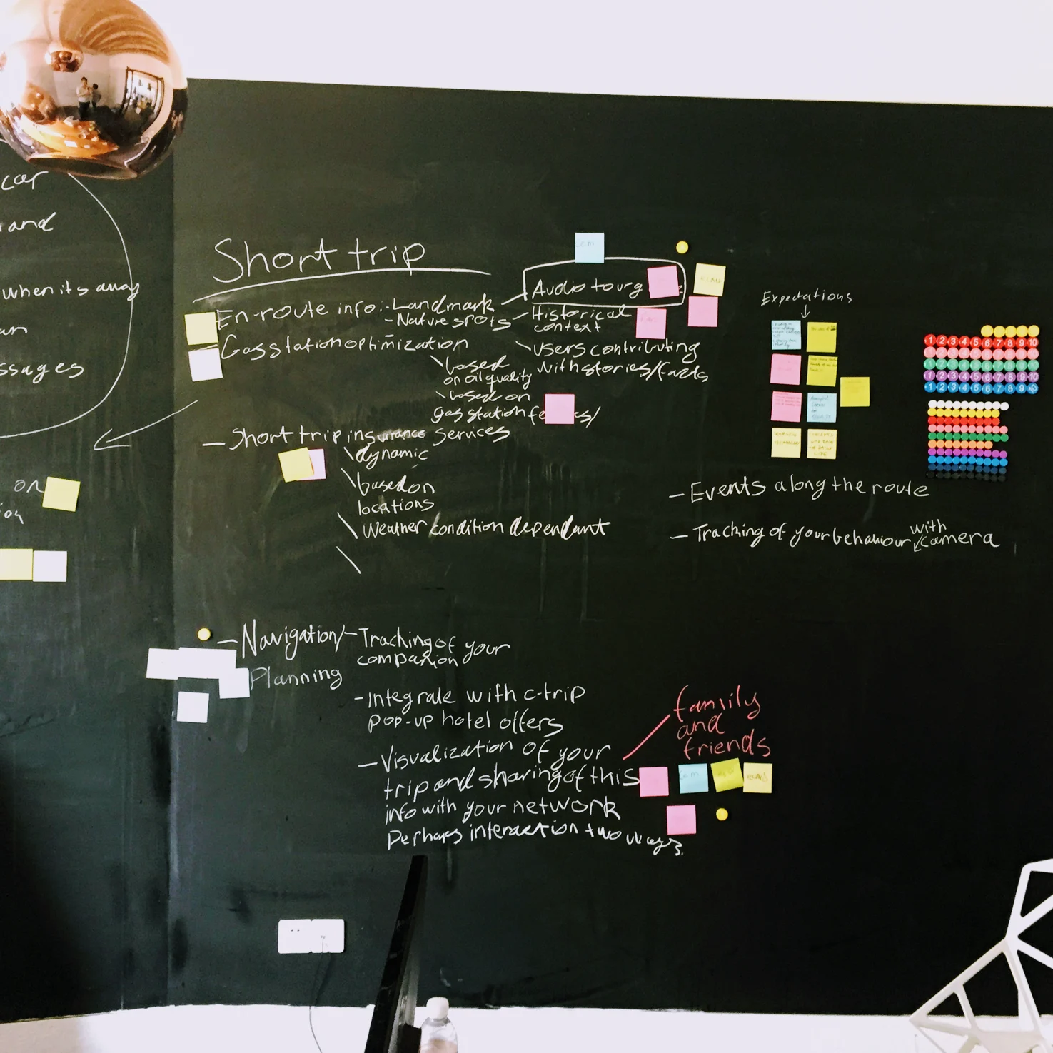
At the same time, I tried to anticipate upcoming features by talking to other departments who wouldn’t approach us proactively. This helped gain confidence in the eternal struggle of menu breadth vs. depth as well as convincing stakeholders with our approach by being able to always provide an answer to their never-ending “what if” questions.

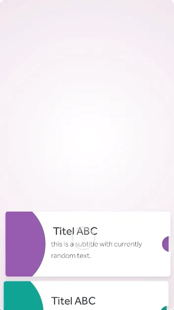
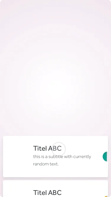
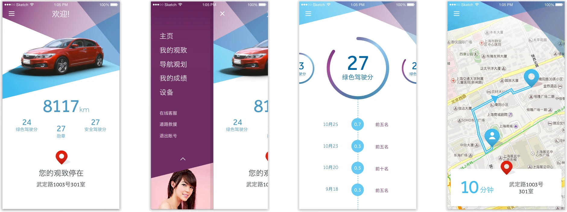
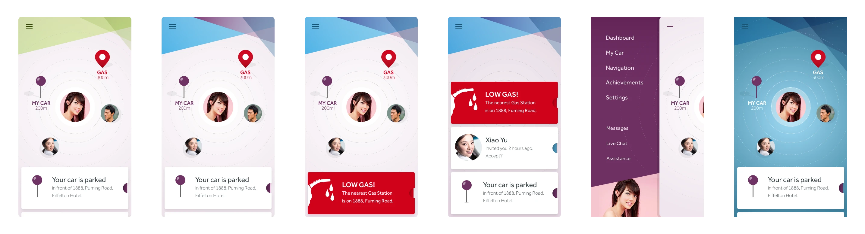
One of the main goals, as stated earlier, was to create an app that felt modern and alive. Naturally, the design language is a huge part of it and we were lucky to have such a talented and experienced visual design team. Getting the feel right, however, seemed to be a less straightforward task due to the sheer amount of features we had to incorporate. We wanted to get all essential things on the landing page without immediately cluttering the interface. Since most (if not all) of them were event-driven (telltale metaphor from cars applies), we categorised all possible events into regular notifications (neutral background), warnings (orange background), and alerts (red background). We used vertically stacked cards with alerts being topmost, followed by warnings, and notifications last. The event-driven nature allowed us to only show notifications if everything was normal and alerts or warnings being shown on demand.

Since we couldn’t find a one type fits all approach for the landing page, we made it customisable. Different users want different things. And we would have a lot of content to select from.

When we felt the app was coming together as a whole we started paying a lot of attention to micro animations, transitions, and interactions. We prototyped a lot of these and obsessed refined and iterated until we felt we had it right (at this point I would like to apologise to all the unwary people we forcefully turned into testers of what we came up with). Prototyping was a big (and fun) part of this project and happened on a wireframe basis at first and later on with actual UI designs.

Outcome

When we finished the design phase, we were pretty satisfied with the outcome. Not only had we met the demands and requirements of a whole lot of stakeholders, but we also liked the design, its interactivity, and the little touches that add up to a holistic experience. As always when there are so many people from different departments involved, the end result is going to be a trade-off. Marketing and Brand obviously had strong opinions on visual aesthetics while technical stakeholders were adamant about implementing features according to their vision.

visual design shot of 4 key screens next to each other

Naturally, not all choices reflect my personal preference (and the visual language did not necessarily age very gracefully, imho) but at the end of the day, we managed to create a blend of Chinese and Western aesthetics, interactivity, and functionality, which received praise from customers, company seniors, and external reviewers.

isual design shot of 6 key screens next to each other

Other work