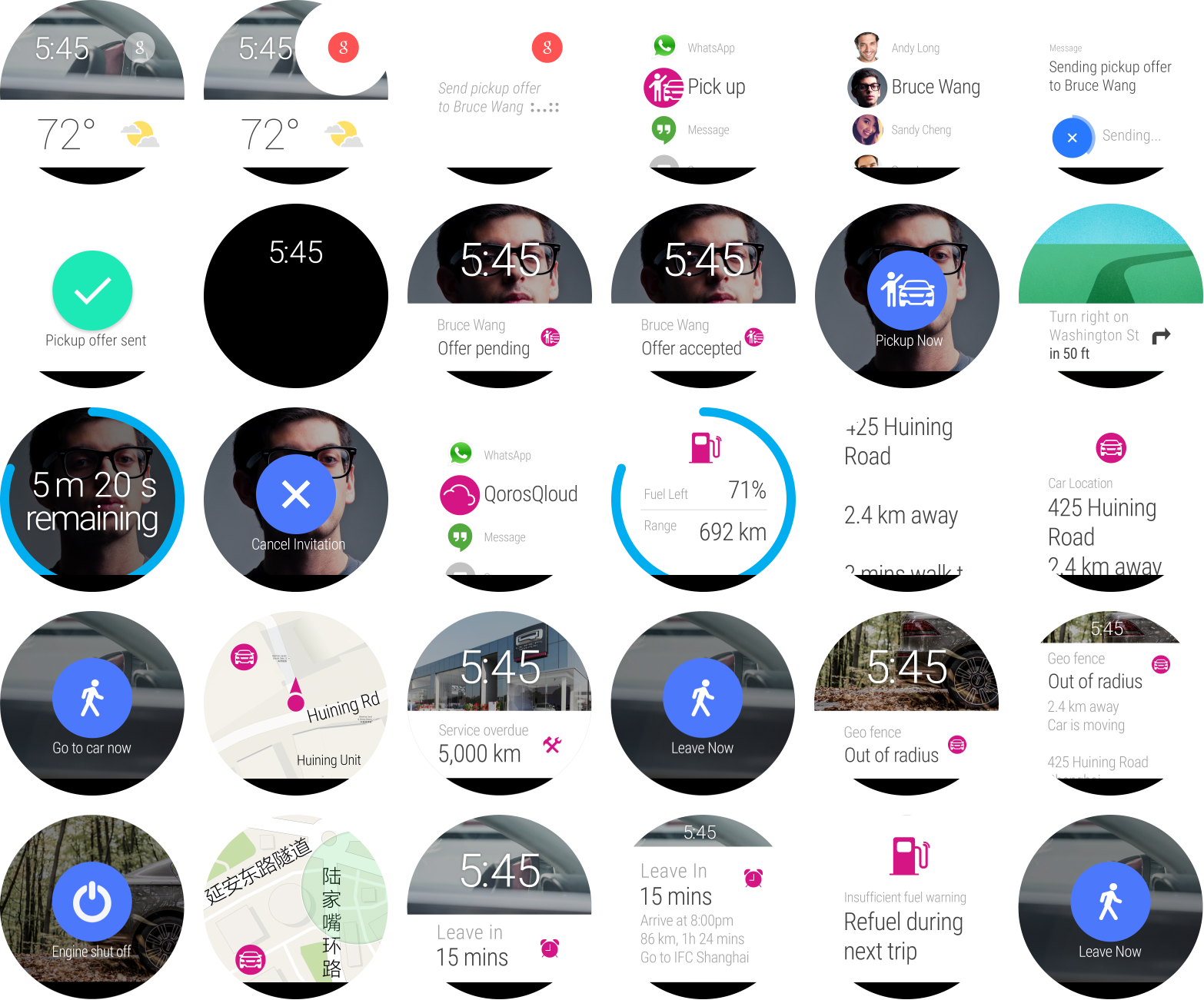
Qoros Smartwatch Apps

With the emergence of smartwatches, we have crafted genuinely mobile experiences to seamlessly enhance the interconnected cloud vehicle ecosystem.


  • Client: Qoros Auto
  • Role: UX, UI, prototyping
  • Year: 2016
  • Status: concluded
beauty shot of a man wearing an Apple Watch that is showing a key screen

👉 [skip this part if you’ve already read a Qoros case study]

Qoros Auto was still a young automotive startup based in Shanghai during my time there. Their products aim at young, hip, well-educated consumers who care more about innovation, connectivity, and value than about brand, status, or status symbols. Simply put, digital natives.

Qoros vehicles are always connected and offer sophisticated connectivity features, back than a rather novel and disruptive approach in comparison to the competition. At the heart of this connectivity lies QorosQloud, an ecosystem for vehicle-, mobile-, and web-based interactions and value-added services.

Task

Shanghai Auto Show 2015 was just around the corner and with the Qoros PHEV 2 we set out to debut an exciting concept car (pictured above). It received the red dot and the iF design award so C-Level wanted to accompany the vehicle with something novel from the digital realm. After several rounds of brainstormings and workshops, we agreed on the (back then) emerging and seemingly up-and-coming smartwatch apps. They brought a breath of fresh air and fitted right into the new flat design languages that came with iOS 7 and Google’s Material Design. This also gave our design team the chance to fiddle with a bolder and flat visual design that should act as a precursor for the already looming complete overhaul which turned into QorosQloud 3 several months later.

After the watches had been chosen, I selected a limited set of halo features from QorosQloud. Since smartwatch interaction is vastly different from more traditional touch devices, features were stripped down to the bare essentials in order to make them easily accessible and provide utility while being on the move. Categorised into Notifcation and Activity Features, those were:

Notification features:

  • Departure Alerts: to help users make it to their appointments on time, departure alerts would notify them on their watch when it’s time to leave (taking into account first and last mile, traffic, parking, etc.).
  • Geo-fencing: users would get notified if their car left a predefined perimeter, allowing them to monitor unforeseen events like theft, being towed, or a child driving further than agreed upon with the family car.
  • Maintenance: if a service interval was imminent or overdue, users would receive a hint. Doing this while not driving seemed more practical than while behind the wheel so you could actually book an appointment straight away.

Activity features:

  • My Car: basic vehicle information like fuel/range and location. Latter could provide pedestrian directions that would guide users to their vehicle. This is essentially first-mile navigation and ties into Departure Alerts (seen above).
  • Pickup Request: one of the distinct and social features of QorosQloud was the ability to request a ride/lift from your social network. Based on the user’s current location, she would request a ride from a Qoros driver who’s nearby. The request would pop up on the driver’s head unit where she would accept or reject it. The requesting user would then get notified about the response and shown the ETA of the driver.

Subsequently, I created user flows and worked out the visual design. The latter is usually not what I do but since there was very little to actually design due to the limited screen real estate as well as strict recommendations/specifications for both watchOS and Wear OS. Moreover, it gave me the freedom to experiment with a bolder colour palette since (not only) I had been getting tired of the (to my highly personal taste) rather subdued primary colour burgundy from Qoros’ CI.

Team & My Role

This is simple: I was a team of one. Aligning with my manager, I was responsible for creating and implementing a smartwatch concept. That meant researching which smartwatches were best suited to illustrate our ideas. The Apple Watch was the obvious choice as it hit a nerve with Chinese consumers (like everything Apple at the time in China). More challenging was to find a good non-Apple smartwatch. We chose the first generation Motorola Moto 360, which resembled a regular watch with its round display nicely and provided a welcome contrast to the rectangular display of the Apple Watch.

overview of a grid of 20+ round smartwatch key screens

Biggest Challenge

Designing for smartwatches is rather straight-forward due to the strict regulations to the Human Interface Guidelines and the very small screens. What’s more challenging was stripping down already existing functionality and adapting it for the very narrow use cases that users want to rather carry out on their watch than on their phone.

Approach

While I was getting familiar with the typical flows and patterns of both watchOS and Android Wear, I started creating user flows. As mentioned before, due to the smartwatch OSs’ inherent restrictions, the flows of the individual features were discrete tasks that hardly ever overlapped or shared functionality. I kept an eye on not deviating from the respective platform pattern and worked out the key screen visual so they could be embedded into the user flows.

Outcome

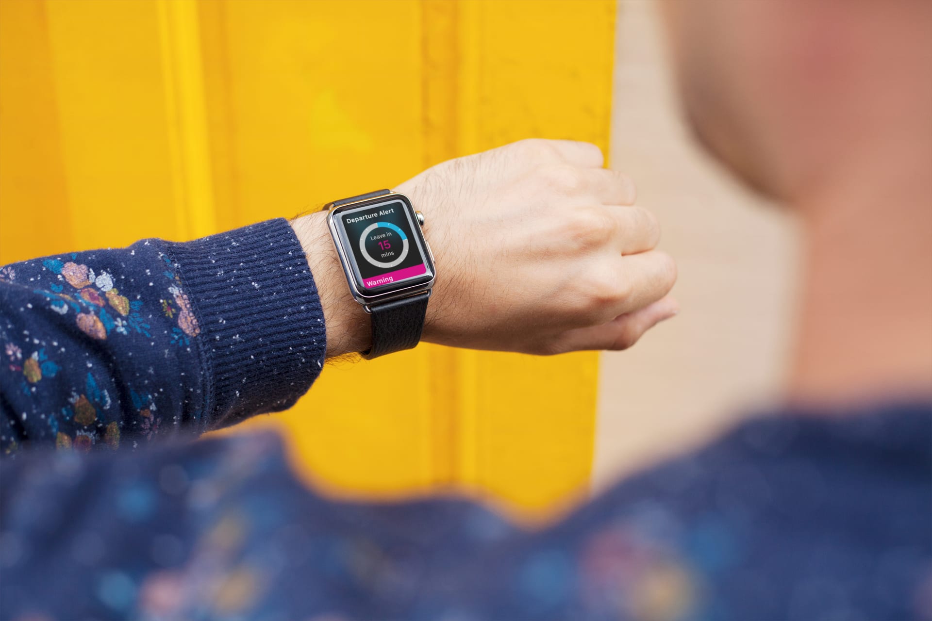
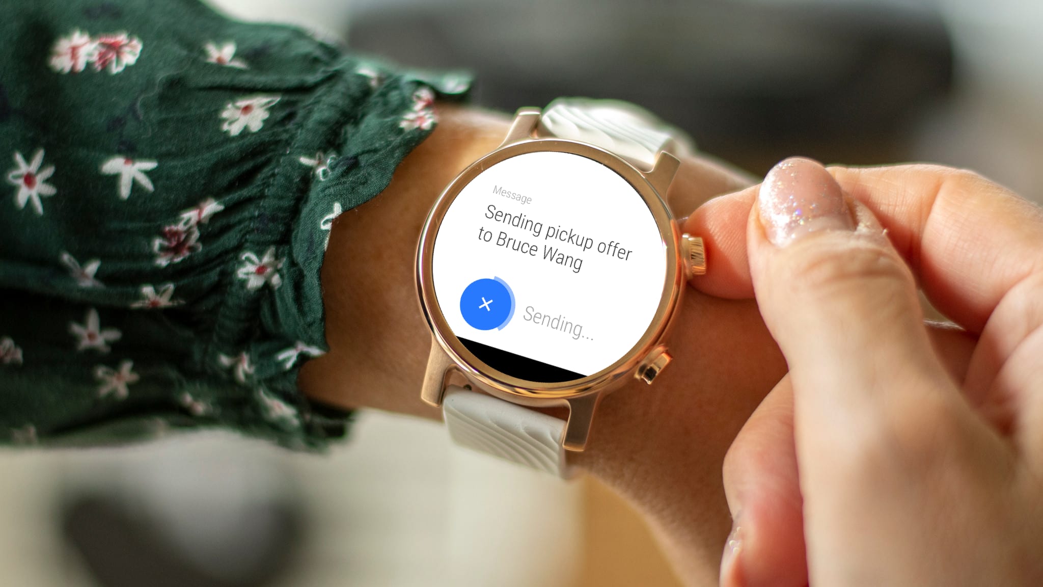
The concept gathered quite some interest from visitors and press at the Shanghai Auto Show. However, I would attest this more to the fact that we had some shiny new Apple Watches on the stand.

What proved more difficult than expected was creating working prototypes after the design phase. There were some technical difficulties with the API and the Motorola Moto 360 turned out as the completely wrong choice. Why so, had it not wowed visitors with its sleek round look? That was certainly the case. However, the Moto 360 ran Android Wear as its OS, which in turn was built around Google services. And those services are all but blocked in China.

However, when we started the project rumour had it that Google was about to make a comeback in China in the imminent future. This seemed more than plausible, given the rapid technological advances of the biggest population in the world. Surely, Google wouldn’t want to miss out on making business in the soon-to-be strongest economy in the world.

Turns out that rumours are oftentimes just rumours. Google still hasn’t come back to China. And all of its resources are not available in China. Which meant that the developers couldn’t access the smartwatch references and APIs. Hence, the project had to be scrapped and will stay a concept. And it’s probably reasonable to say that we took a chance and lost.

beauty shot of key screen showing on a smartwatch that is worn by a man

Other work