Objective
- Phase: review concept, visual design, and overall user experience of the new in-house design prior to launch
- Phase: after review, consult, design, and implement anything related to design, strategy, brand, and roadmap
As the internal product development process progressed, the initial vision shared between Design and C-level stakeholders began to deviate. External expertise was needed to bridge this gap and foster a unified vision for the product.

For the longest time, we just listened to what power users requested

The project comprised two distinct phases and an additional third phase was integrated on-the-fly.
I was tasked with conducting an expert review of the recruiting platform being developed by the internal team. The goal was to align the product vision with the design team's vision and ensure consistency in look and feel.
To accomplish this, I immersed myself in the domain, engaged with various stakeholders, and developed a deep understanding of business needs, user segmentation, and job-to-be-done. After a thorough analysis of the current and new products, I identified usability issues based on established heuristics.
To bridge the gap in design language, I curated examples of cutting-edge UI design trends that resonated with the company's identity. I then extracted key visual characteristics from these examples and compared them to the in-house design language.
Upon presenting my findings to the C-level team, I was tasked with developing a comprehensive action plan for both short- and mid-term fixes. This led to my involvement in the implementation phase, which ultimately extended my role and responsibilities.
During this phase, I conducted a comprehensive examination of the existing product, untangling the complexities of feature bloat that had accumulated over time. This involved scrutinising user feedback, usability testing, and collaborating with stakeholders to identify and prioritise core functionalities.
As part of my approach, I integrated competitor analysis to gain valuable insights into industry trends and user expectations. This strategic research informed the prioritisation process, ensuring that our features not only met user needs but also surpassed industry benchmarks.
To drive innovation, I implemented design sprints for the development of new features. These focused, time-boxed sessions facilitated rapid ideation, prototyping, and validation, allowing us to swiftly iterate and refine concepts before integration.
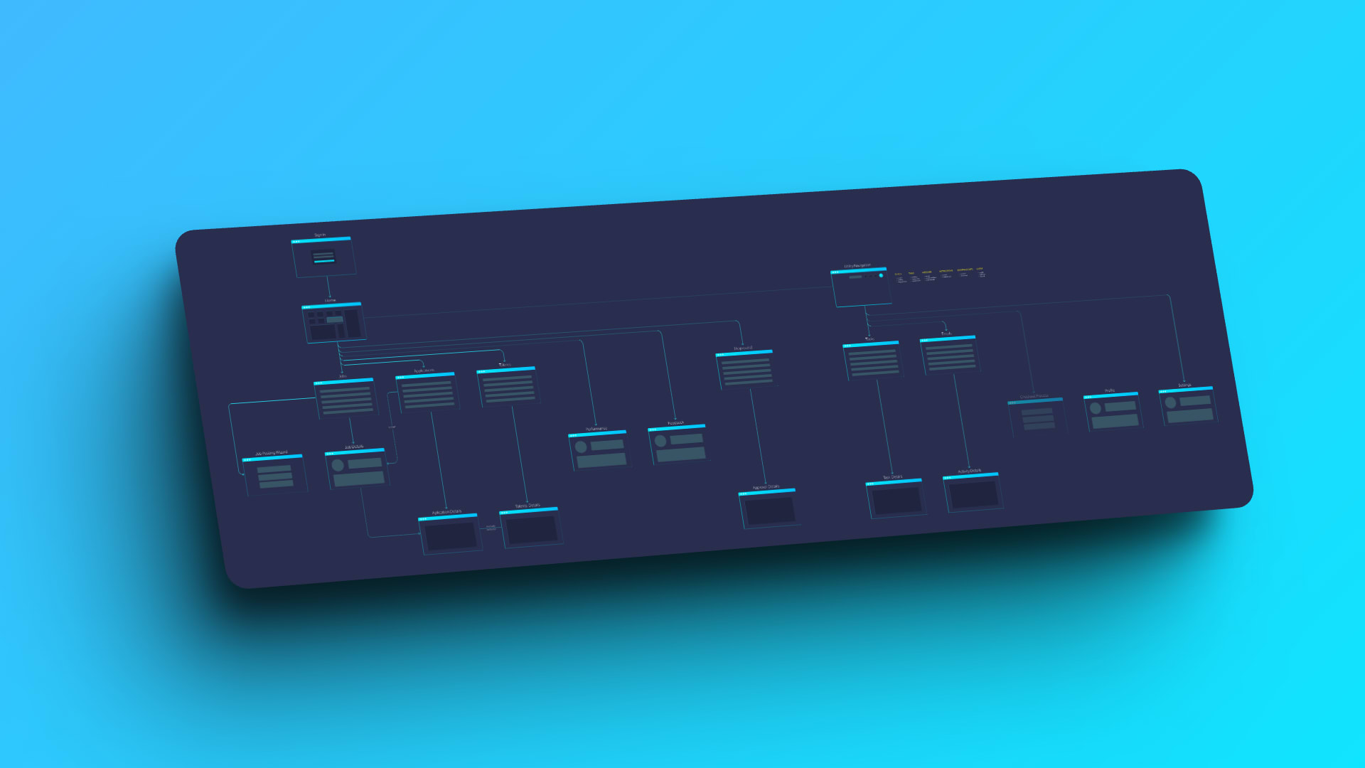
Simultaneously, the roadmap evolved into a strategic guide, considering dependencies, technical feasibility, and the overarching goal of decluttering the user interface. This approach aimed to enhance overall user satisfaction by delivering a streamlined, competitive product.
Collaboration remained integral, with ongoing communication and iterative feedback loops ensuring seamless integration with the development team. This collaborative effort maintained alignment with project objectives and user expectations.
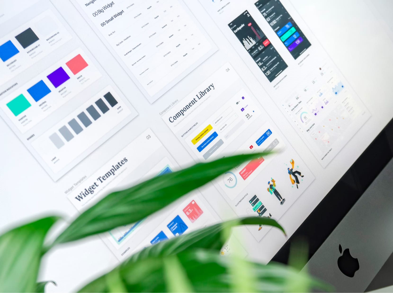
The introduction of a design system further reinforced consistency and efficiency in the design process. This standardised set of design principles, components, and patterns not only accelerated development but also ensured a cohesive and polished user interface across the product.
In the Feature Definition and Roadmap phase, my commitment to strategic prioritisation, competitor analysis, design sprints, and a robust design system converged to create a more intuitive, streamlined, and competitive digital experience. This comprehensive approach not only addressed existing challenges but also paved the way for continuous innovation in UX design.
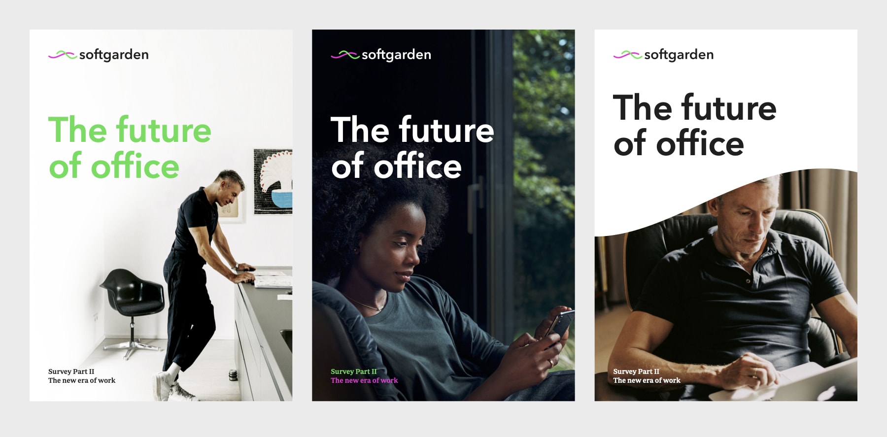
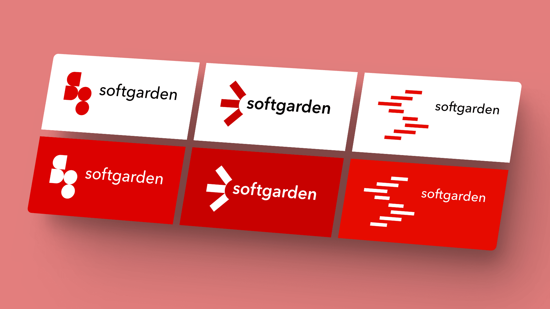
Recognising the imperative to elevate the company's visual identity, I led a comprehensive initiative to update and modernise our corporate design and branding materials. Conducting a thorough analysis of market trends and user perceptions, I identified the need for a fresh and contemporary visual language that would resonate with our target audience. Acknowledging the complexity of this task, I collaborated with a seasoned freelancer, an experienced expert in branding, to ensure a nuanced and impactful transformation. In my role as the product designer, I provided clear instructions and consultations to guide the branding expert, aligning the visual elements with our user-centric ethos. Together, we crafted compelling proposals that not only adhered to design principles but also encapsulated the essence of our brand.
Distinguishing our approach, we navigated two main routes. The first involved a careful evolution, where we refined existing elements to maintain brand continuity. Simultaneously, we embarked on a second route, exploring three completely novel corporate designs to push the boundaries of our visual identity. This dual-pronged strategy allowed us to strike a balance between preserving brand recognition and embracing innovative possibilities. The result was a suite of proposals that presented a cohesive evolution of our corporate identity, offering our audience a refreshed and modern visual experience while staying true to the core values of our brand.

My contributions extended beyond the core product, influencing various facets of the organisation. The redesign efforts not only revitalised the user experience but also resonated in marketing, product roadmap, branding, process, and recruiting.
In terms of UX and UI, the project ushered in a multitude of improvements. By reevaluating and redefining essential features, coupled with the removal of seldomly used elements, we achieved a significantly leaner and more streamlined product. This not only enhanced usability but also contributed to a visually appealing interface, reinforcing positive user engagement.
Simultaneously, the introduction of new features, informed by user requests, research findings, and innovative design sprints, marked a pivotal shift in the product's capabilities. User testing became a key validation point, affirming the user-centric approach and ensuring that the new features seamlessly integrated into the existing ecosystem.
The positive impact extended to marketing, where the updated product became a compelling focal point for promotional efforts. The refined branding elements, encapsulating the essence of the redesigned product, contributed to a more cohesive and resonant brand image.
Furthermore, the redesign influenced the product roadmap, aligning it more closely with user needs and market demands. This strategic realignment not only enhanced the product's competitiveness but also facilitated more agile and informed decision-making in the development process.

My tenure as a product designer & design consultant involved seamlessly navigating diverse roles in a complex project. Wearing numerous hats, I brought extensive expertise to bear on the intricate aspects of the project, engaging with a wide array of stakeholders. This multifaceted approach not only addressed the immediate project intricacies but also made a meaningful impact across various dimensions of the organisation. Notably, these experiences played a decisive role in supporting recruiting efforts, underscoring the versatility and comprehensive contributions made throughout the project's lifecycle.